Hong Kong FinTech Week is one of the city's largest conferences for the finance and technology industries. I have been responsible for developing the visual identity for 2023's event. Given the scale and scope of the work, I have also led the recruitment and onboarding process to expand the internal design team. Since hiring new designers, my role has expanded to project management and art direction.
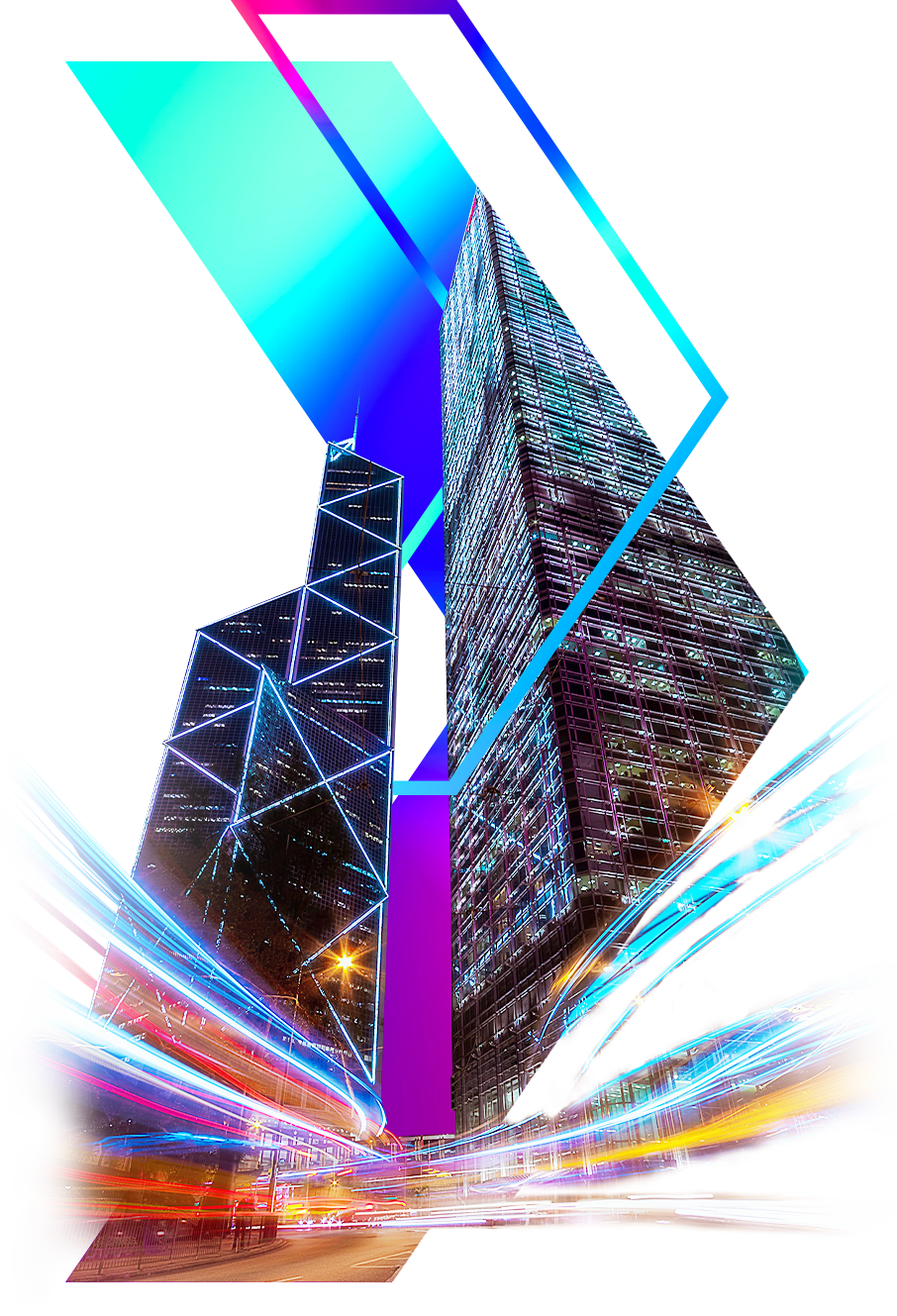
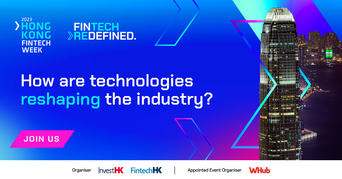
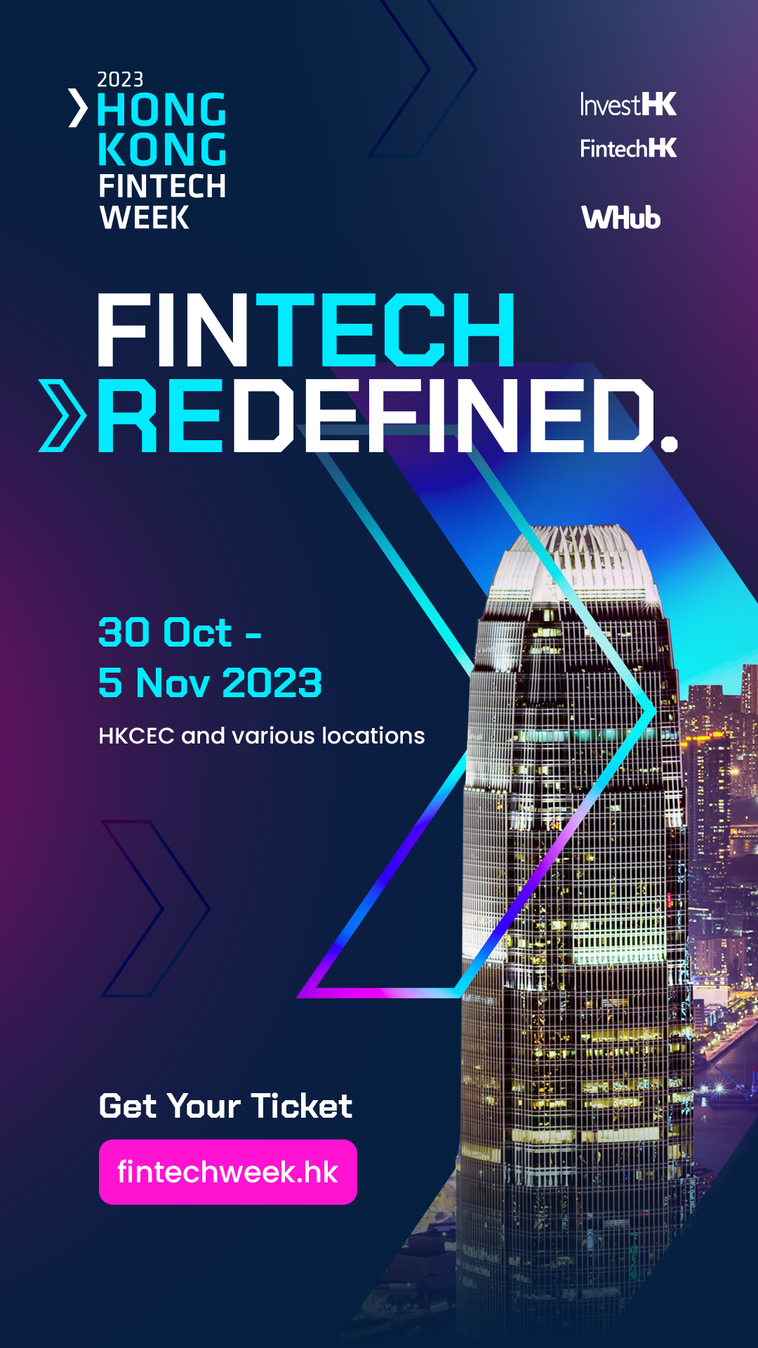
Hong Kong's iconic buildings represent the heart of FinTech in the city and reinforce the its position as a global financial hub. For high level promotional material, we selected photos of these buildings from unconventional angles. The arrow device extracted from the main logo serves as a sharp framing tool, adding depth and impact to the overall composition.
The overall identity evolved into three distinct phases:
Phase 1 - Introduction: mainly graphics using cutouts of Hong Kong's skyline.
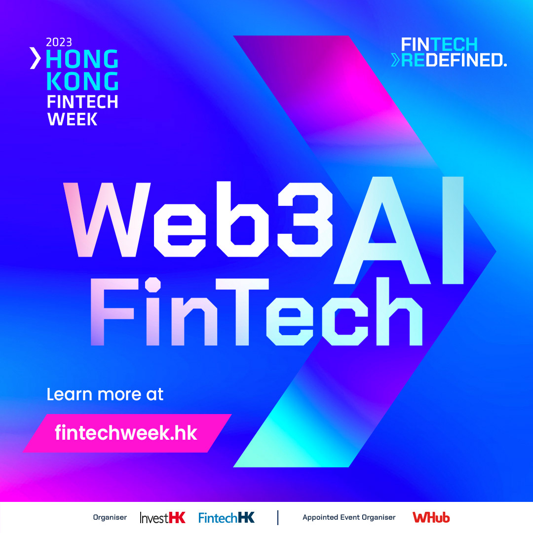
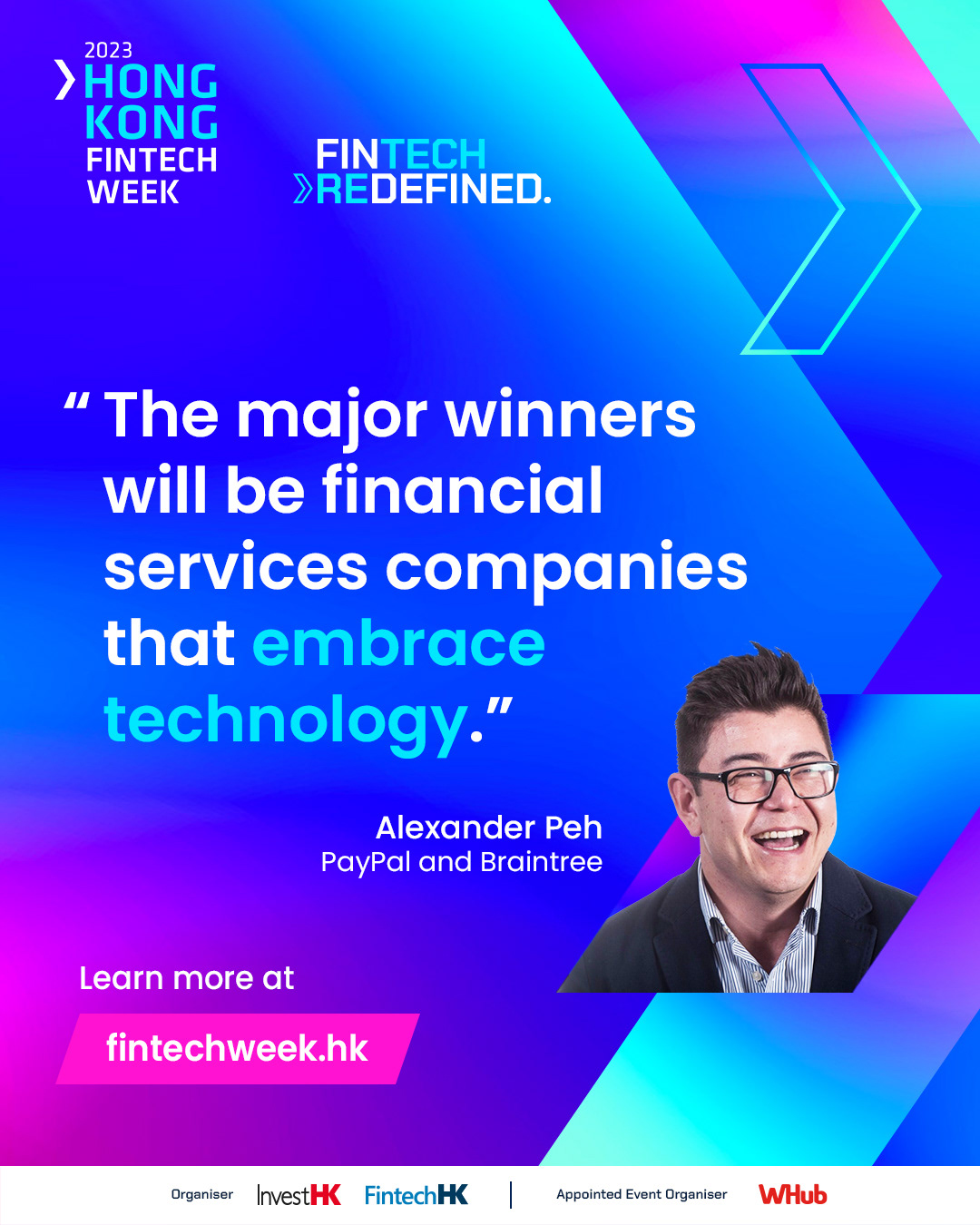
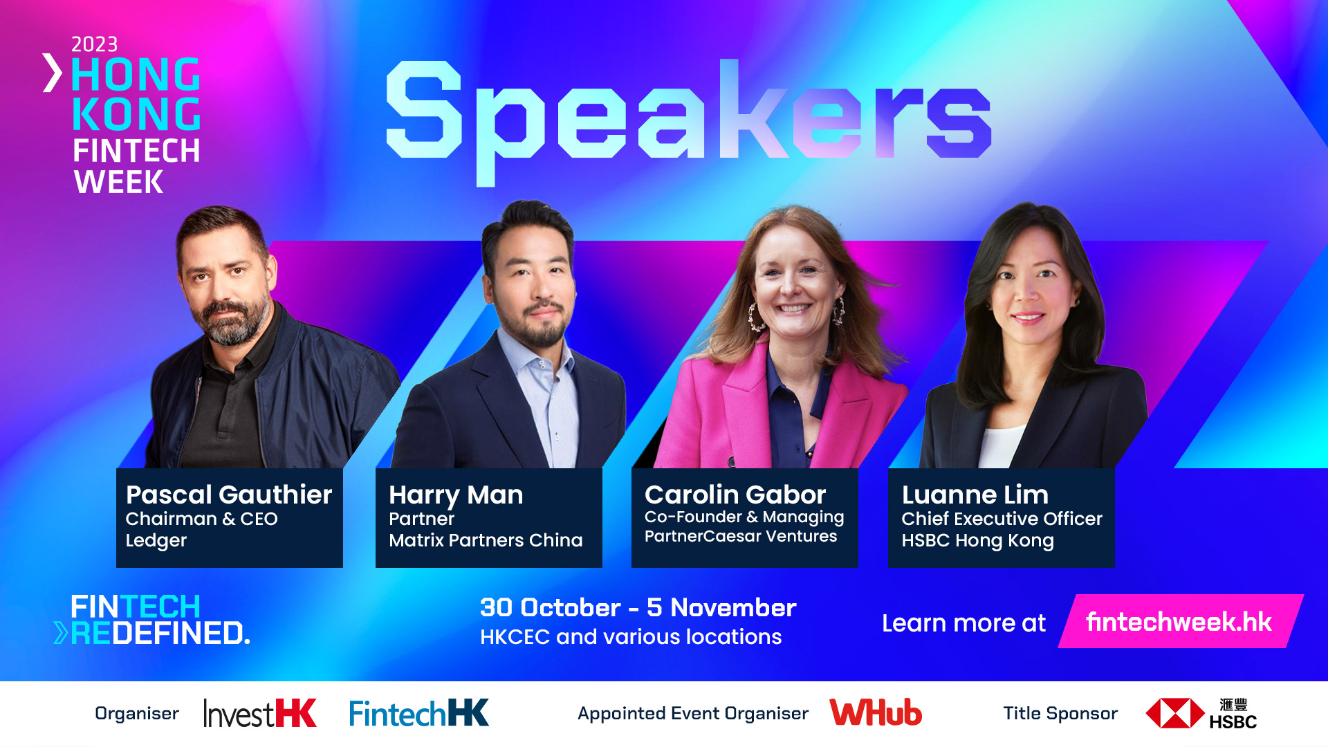
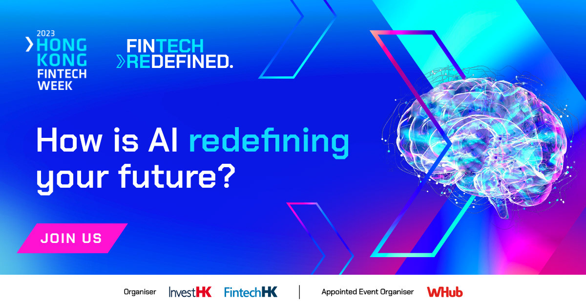
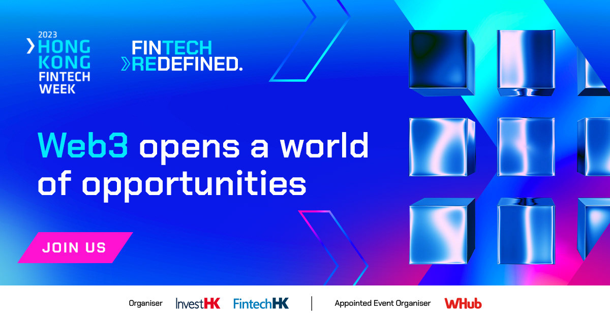
Phase 2 - Promotion: vibrant and colourful visuals to catch the eye for promotional purposes.
Phase 3 - Function: dark background and simpler visuals for functional purposes at the live event, such as signage and screen content.
Phase 1 - Introduction: Hong Kong skyline



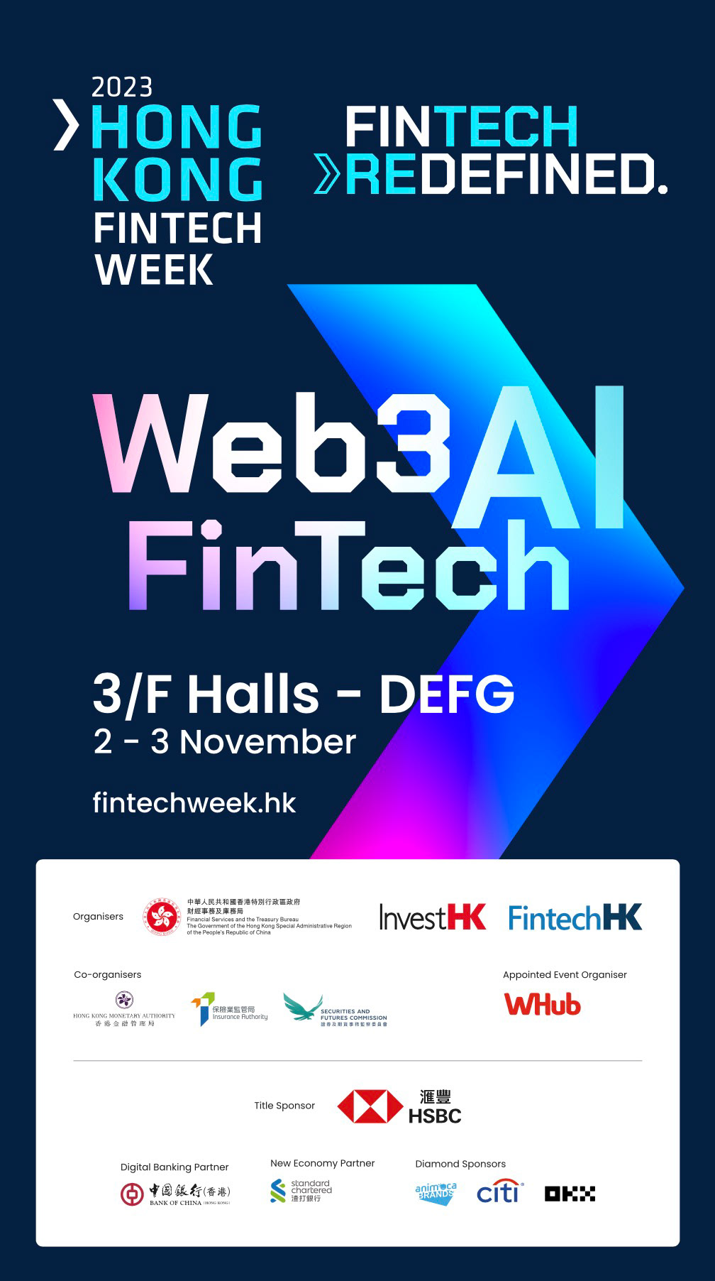
Phase 2 - Promotion: vibrant and eye catching
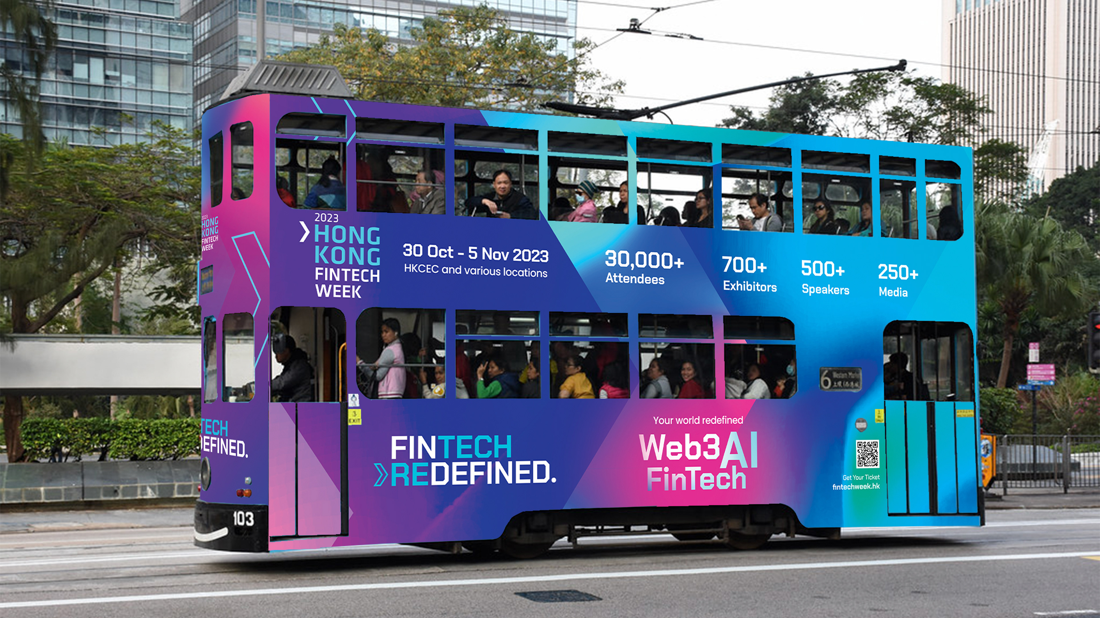
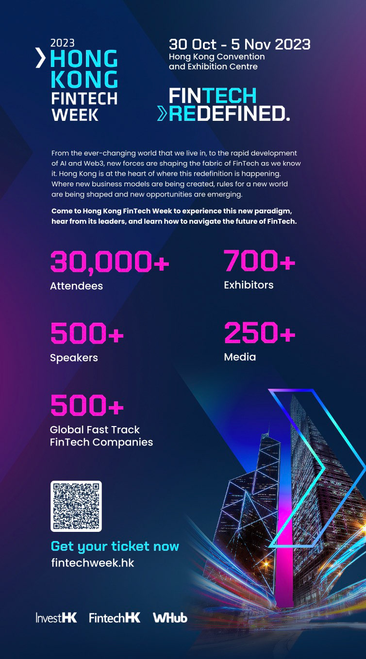
Even though the whole group of visual assets should be part of the same identity, their unique functionalities require different brand elements to come to the foreground. For instance, social media visuals make the most of vibrant gradients, whereas more informative visuals (such as editorial promotion) require a more toned down approach, where legibility is key. It's important to find the right balance between dark vs. vibrant, sober vs. extravagant...
Social Media & eDMs



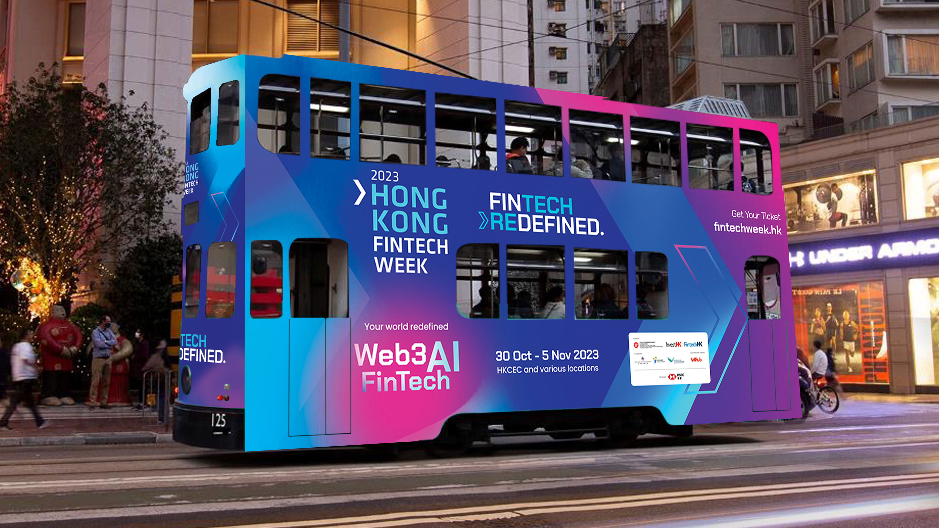
Outdoor Ads
Editorial posters

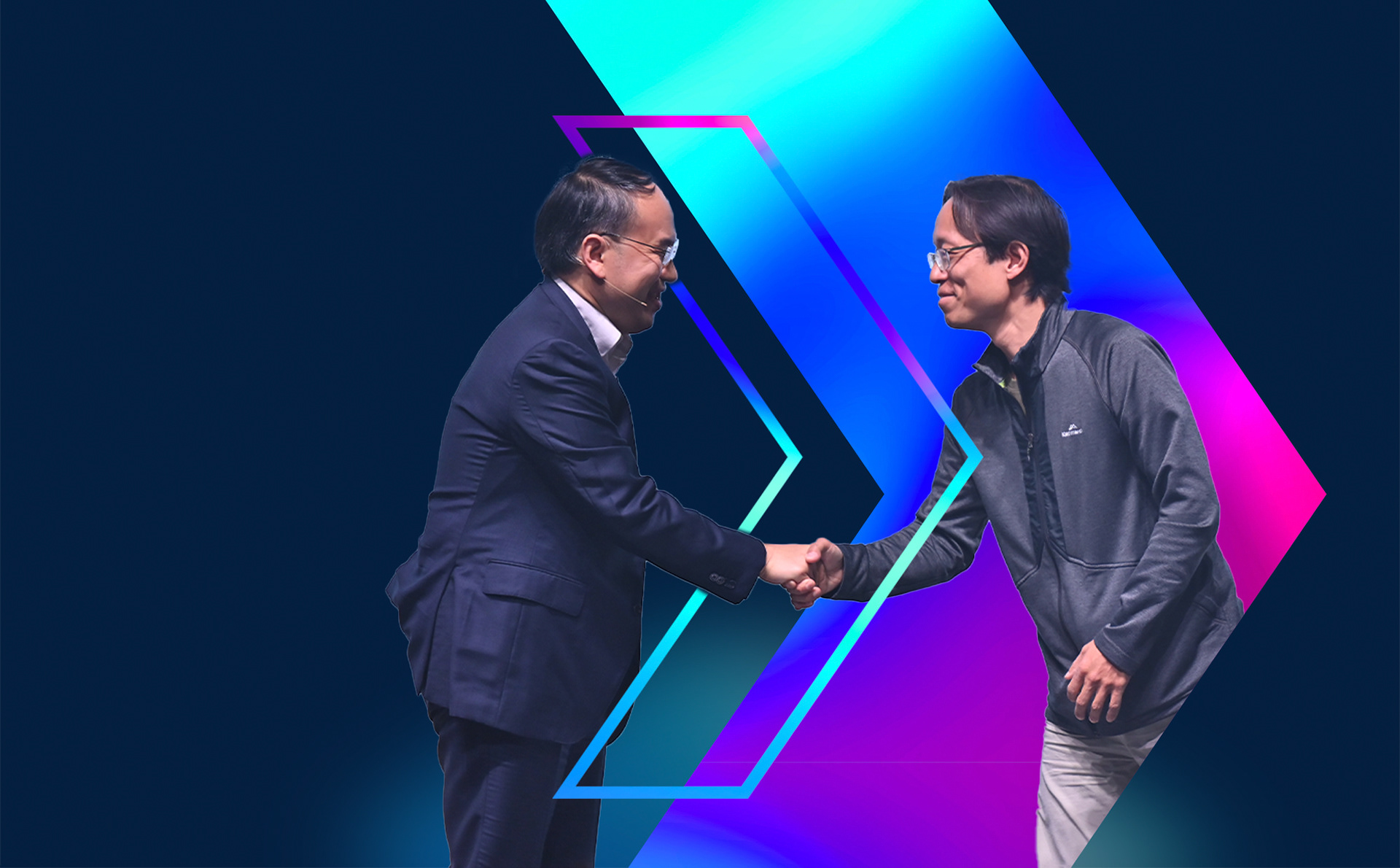
Phase 3 - Function: Live Event Assets
Signage Examples



Screen Content
Screen content was particularly challenging given the scale of the some of the stages and multiple technical variables to be taken into account. I worked closely with the technical team to make sure to meet their requirements.
The event has four stages based on themes, and they all have different specs. I have animated some of the content (especially for the larger Centre Stage) and created a design system to make sure the information for all sessions can be easily updated by different members of the team. Given that the event has more than 140 sessions, it's crucial to ensure the information displayed is correct and can be easily changed even at last minute if necessary.
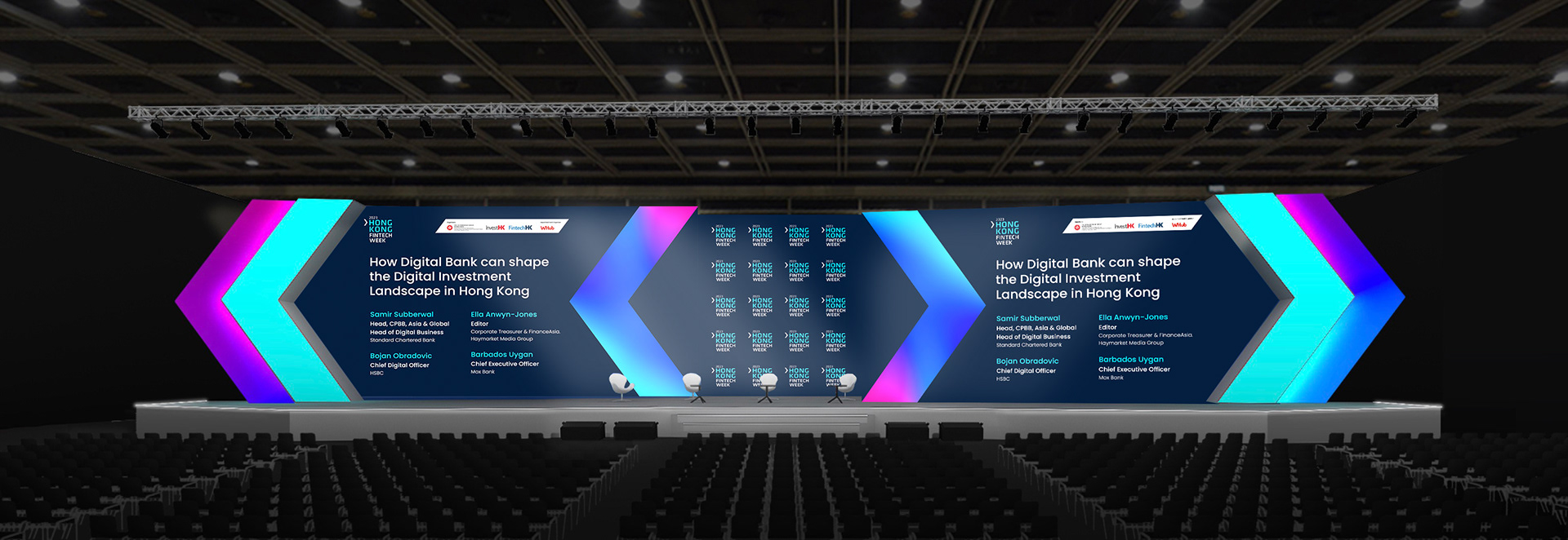
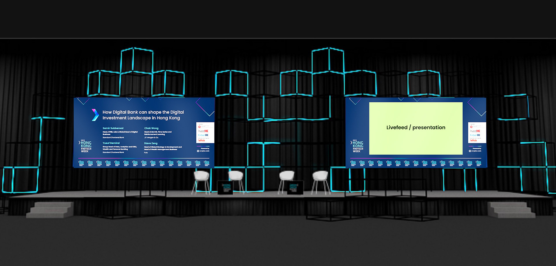
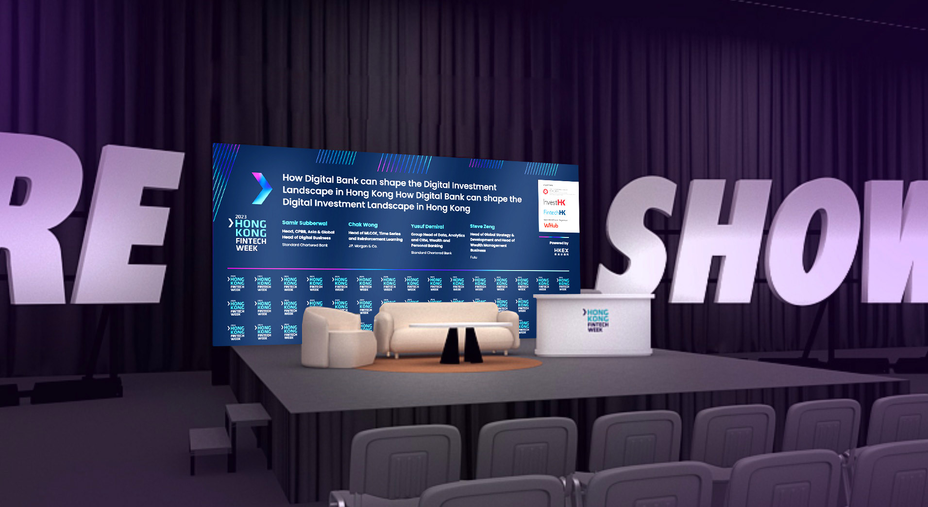
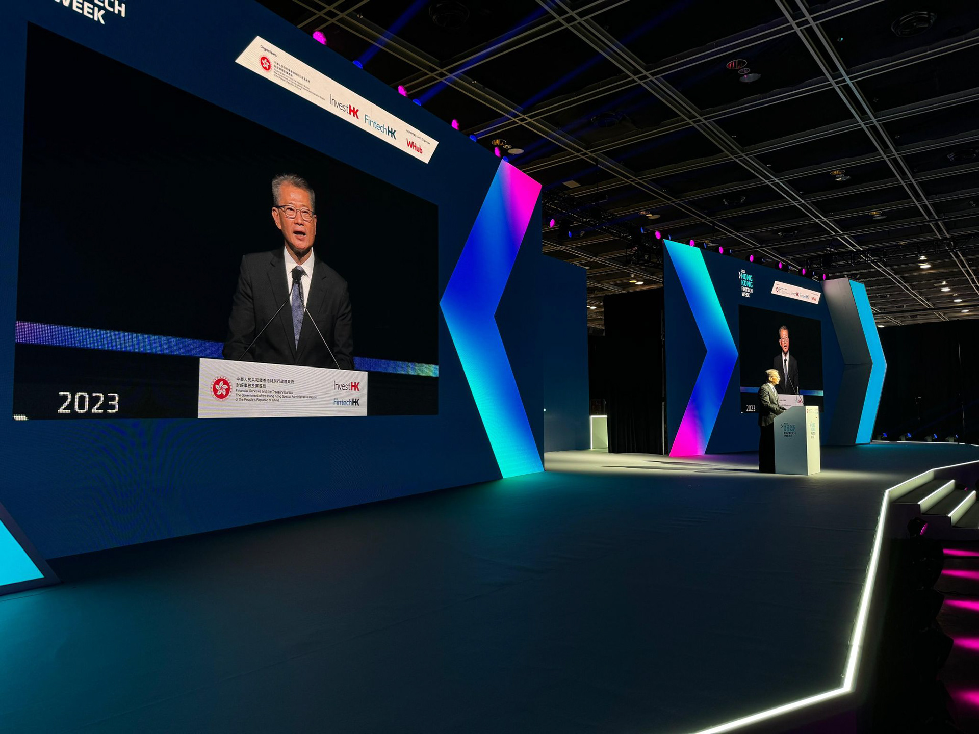
Photo credit: Hong Kong FinTech Week / InvestHK
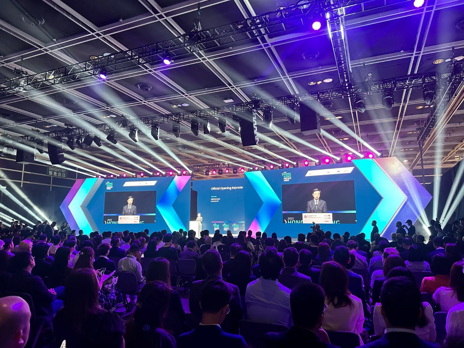
Photo credit: Hong Kong FinTech Week / InvestHK
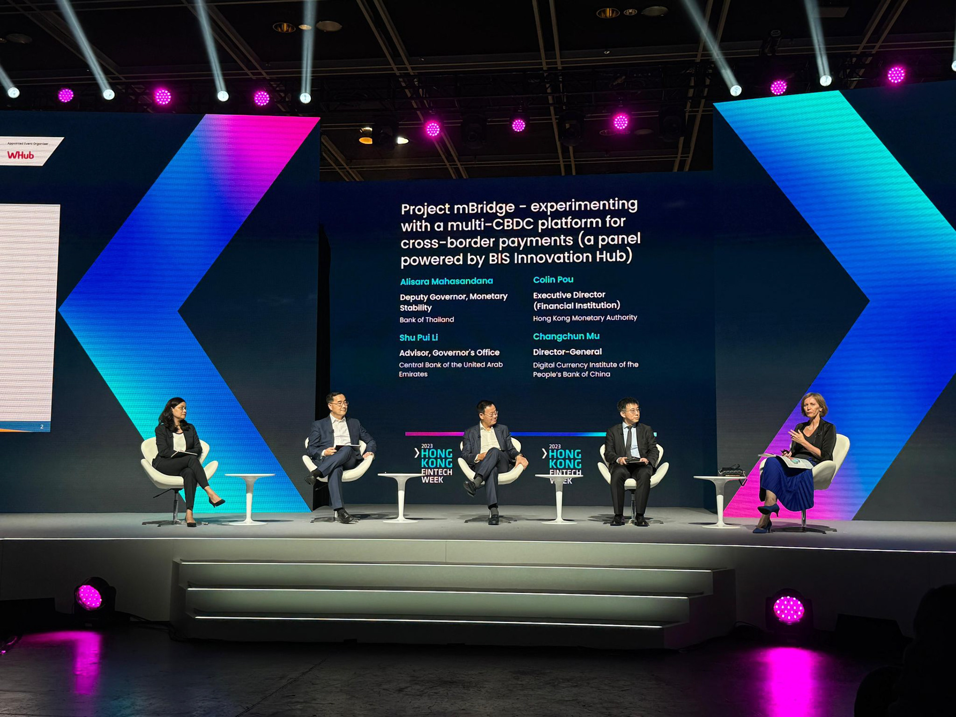
Photo credit: Hong Kong FinTech Week / InvestHK
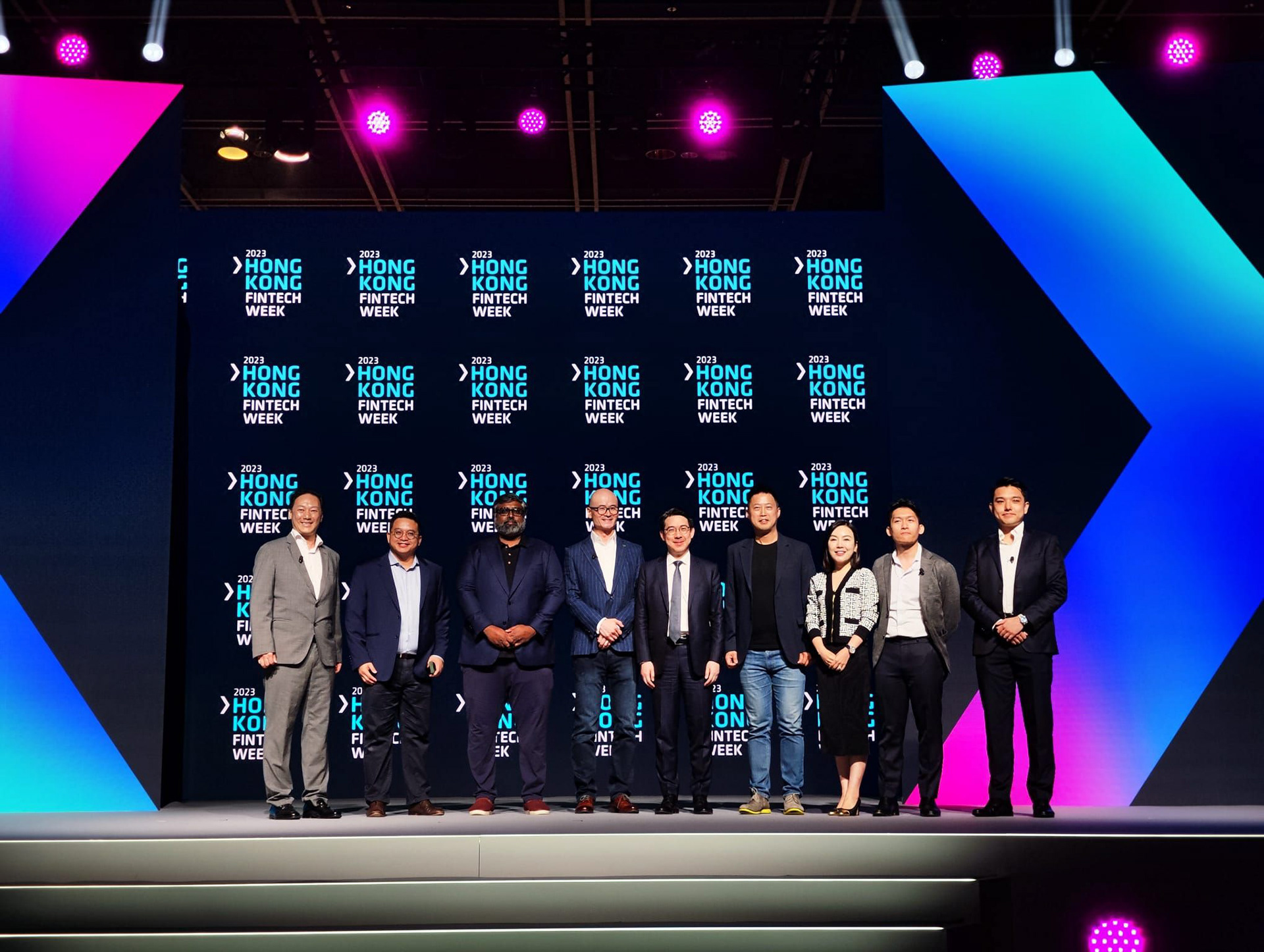

Photo credit: Hong Kong FinTech Week / InvestHK
Brand Guidelines
In order to summarise the core of the brand, I have developed a live document that has been shared with multiple partners and suppliers. This asset is essential to make sure different parties are aligned with the same principle. The idea was to avoid creating an overly complicated document, and instead build it progressively, as new requirements arise.