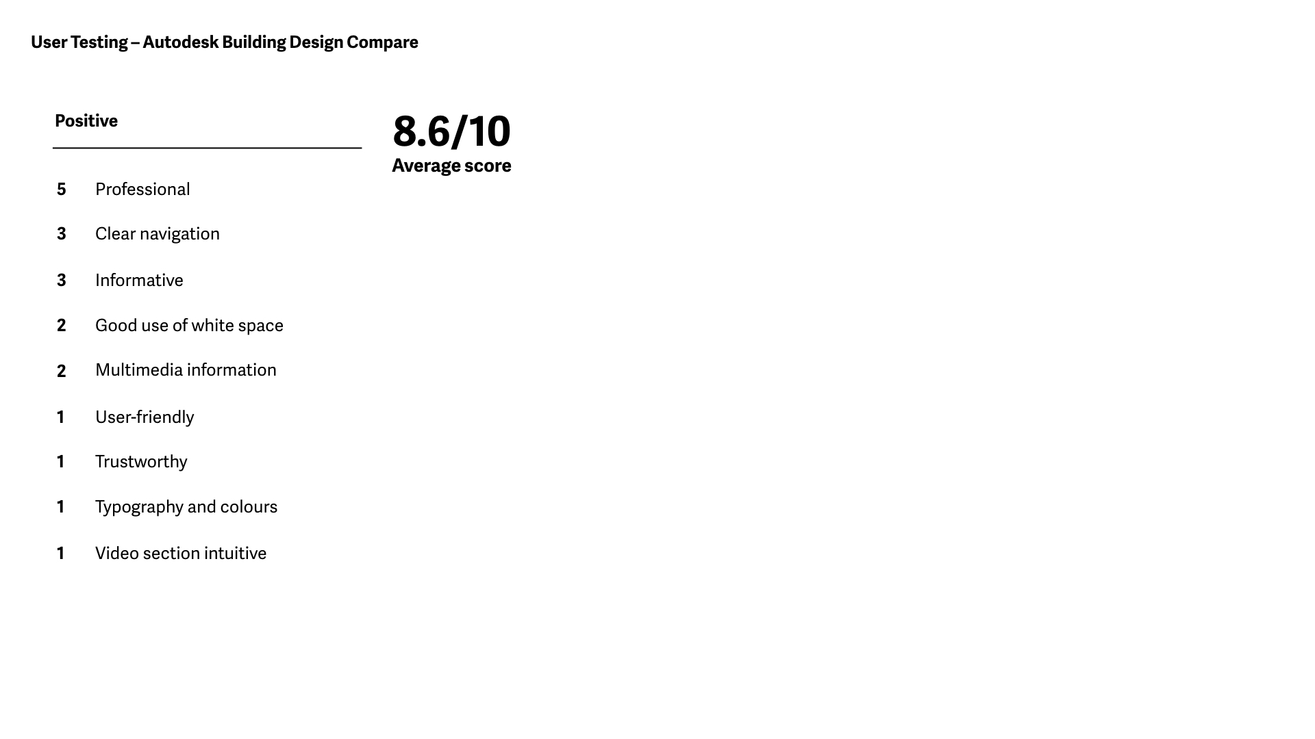
The following projects were part of a series of requests from Autodesk to optimise some of their current AEC campaign pages. After analysing the data provided (such as conversion rates and heat maps), I came up with suggestions to increase usability and engagement following Autodesk's style guides.
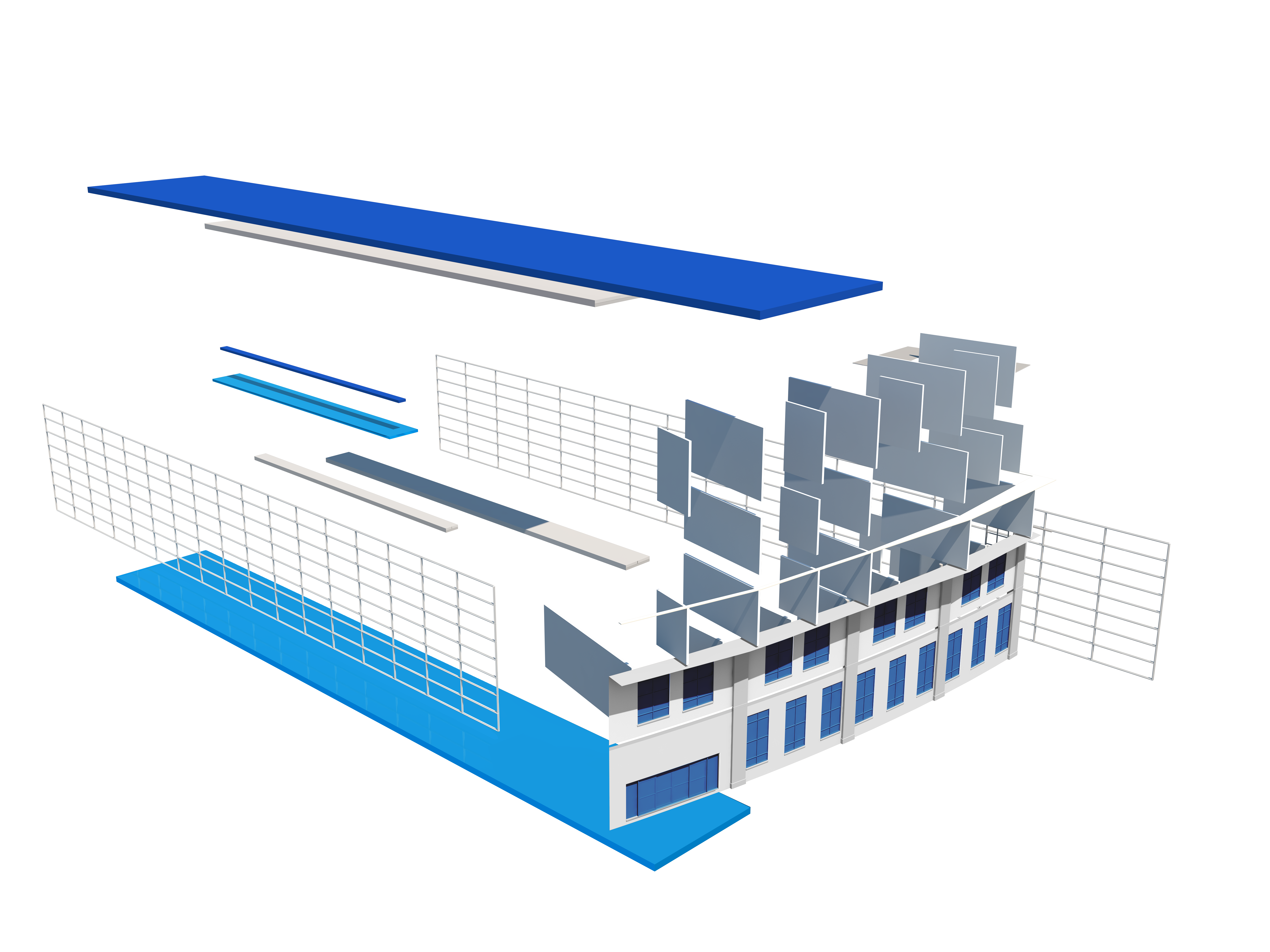
1. Building Design campaign page

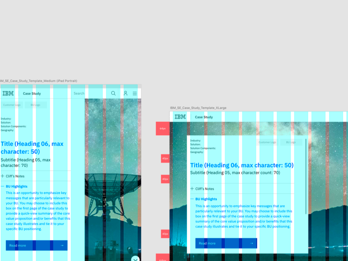
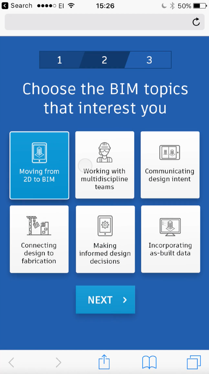
2. Building Design campaign: interactive mobile experience
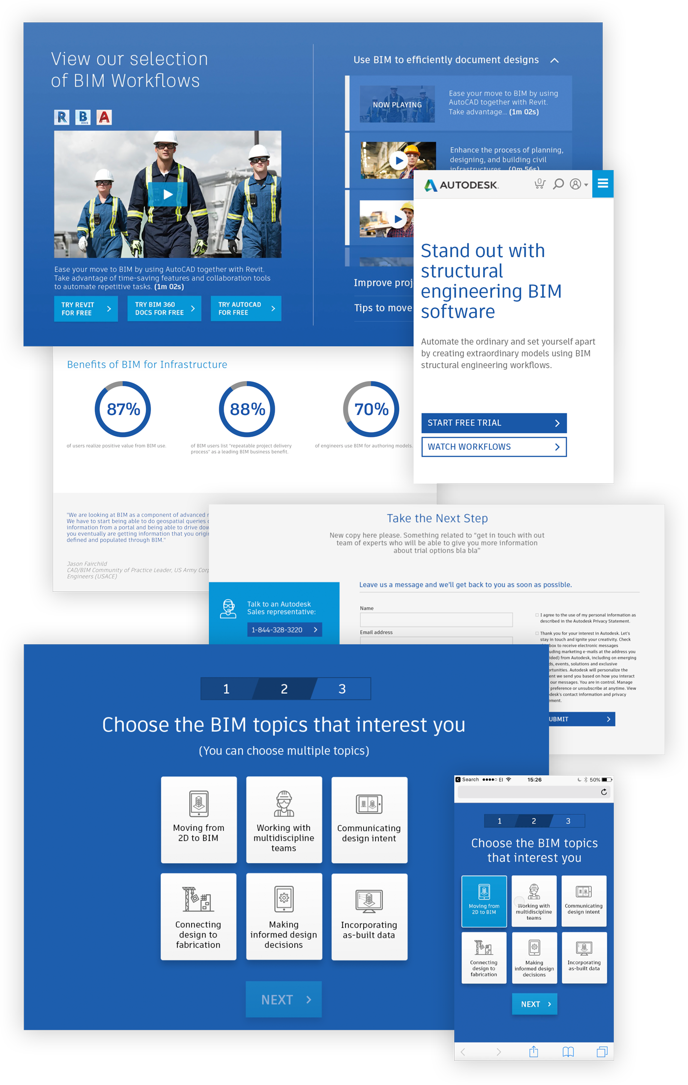
The original experience was a simple set of 3 steps, with two questions and a form. The UI wasn't optimised for mobile and the user had to scroll down the page to access the next stage. I proposed having a more bespoke experience, where a top bar and the question would remain in a fixed position. The transition between steps would align cognitively with the navigation bar, by having a subtle horizontal slide.
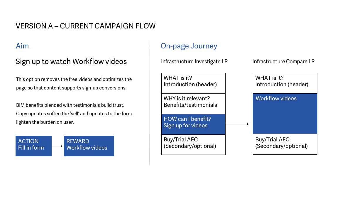
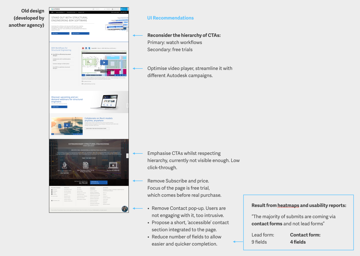
3. Infrastructure campaign page: AB test
Autodesk requested the redesign of a single landing page, but with two disparate points of action. If added to the same page, these CTAs could compete for the user’s attention and perhaps reduce conversion rates even further.
Knowing that users tend to make decisions quicker when given less options, I’ve proposed an AB test instead. Both webpage versions have the ultimate aim of persuading users to try Autodesk’s products, yet each does it in a particular way and has a slightly different role within the overall campaign journey (see below).